

This weekend I took the plunge and sought out the newest version of Audirvana, my preferred, nay, favorite audio playback software. I’ve been using it exclusively for listening to my local collection of music on my computers for nigh 4 years now and I love it.
But will I love 3.5?
With a completely overhauled UI and a new Windows version to go along with it, there’s a lot of new code in here. I’ll be testing the MacOS version on my still functioning 2012 Mac Pro running Mac OS version 10.13. Audirvana (the “Plus” seems to have been dropped from the moniker) has so much new in it, I’m surprised the author didn’t give it a brand new 4.0 badge.

Listening through a Topping DX7s DAC/AMP with Adam A7X monitor speakers and Hifiman HE4XX headphones. I will say straight away that I don’t think you’ll notice any change in sound quality. It’s still top-notch and sounds great. I don’t use any of the upsampling or signal processing options available – and there are several to choose from. I like my signals unadulterated by my signal path.
My other major use is streaming to my Hifiberry equipped Raspberry Pis running Volumio. I have two in the house, and Audirvana is a great solution for sending my playlists and library content to them, without having to use the less capable interface Volumio provides.
Installation of the update went smoothly enough. I entered my registration key on the website and was given the new version. Upon dropping it into my Applications directory and launching it, I was prompted to migrate import* my library. This immediately gave me pause, but what the hell, I figured, and clicked OK to start the process.
(Checking ~/Library/Application Support/Audirvana reveals that a new database is built with the 3.2 version left intact – whew!)
After import, you’re guided into the new Settings panel where you can select your library location and playback device and associated options. As usual, Exclusive mode and Integer mode are there so your music gets the whole device. Other options like upsampling and the SysOptimizer that kills a bunch of processes on your machine to “improve performance” are there for the adventurous. I leave those off.
Oh yeah, there’s also a “streaming” section with entries for Qobuz, Tidal and HighRes Audio. I don’t use those services so can’t really comment on their integration.
- *edit: Note that I did originally say that Audirvana wanted to “migrate” my iTunes library. Please note that this is a non destructive process and in no way affects the iTunes library, your song files or their location on disk. It merely builds a database for Audirvana to use. Thanks for mentioning that in the comments, Ella!
So, let’s get to the Interface.
There’s a new Dark Theme which turns the whole thing into a deep royal blue. It’s enough of a color to be discernible against other dark windows on Mac OS. Light Mode is almost pure white and probably not what you want in a dark listening room at night.
Probably my favorite new addition is the inclusion of a mini window. Play/Pause, shuffle and skip controls and a small album cover are all you have in this mode and it’s perfect when you’re listening and want to park it in a corner while doing other stuff. It doesn’t scale particularly well, unfortunately. If you shrink past a certain size, some of the buttons and text can get pushed outside the boundaries, though not always! Biggest omission, in my opinion: No “Heart Button” to fave currently playing track.

The Library view is probably the most jarring change in the app. Gone is the familiar multi-columned browser with drop downs for narrowing your music selection to evermore specific criteria. We have Album and Artists groupings now with nice visuals for both of them. The Tracks grouping shows every track in the library in a rather large list. If there are options to change font size I can’t find them.
Your options for limiting how much appears in that list are relegated to a “Filters” panel on the right. You can select Genre or Artist or a number of other criteria to choose from. Unfortunately, it doesn’t seem to work very well. If I select more than 2 genres at a time it clears one of the other options. I’ve managed to get 3 selected at once but more than that and the selection gets unpredictable.
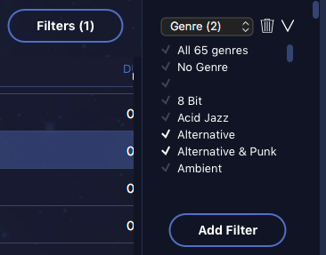
This feels like a huge step back from the familiar 3 column interface I’m used to and have been using for fifteen years (shoutout to OS X Panther and iTunes 4.1!). It’s slower and harder to use. If the multi-selection thing worked reliably, and allowed more selections, I wouldn’t find it as cumbersome. The ability to save Filter layouts would also be helpful.
In theory, you should be able to save them as Smart Playlists, but those have been changed again as well. After the update both of my Recent Additions playlists were empty and I had to recreate them.

The language for the selection criteria in the Smart Playlist editor is a bit … confusing. “Added Date / Is Later Than or Is : 30 Days Before Today” Is probably not the language I would have used. “Date Added: Before, After, Between” and “Days, Weeks, Months” would have been clearer. Between could have a date range picker. Dates are hard, I get that, but this is another step back in functionality and clarity from the previous version.
None of this is really unexpected with a completely new UI. My hat is off to Damien for the hard work he’s put into this. Bringing this fantastic player to Windows is huge enough, but adding a new UI to Mac OS is a daunting challenge. If I had to guess, I’d say he got the UI for “free” (as in a lot of work building a cross platform UI) when rebuilding for Windows. It’s no coincidence that the new interface has elements that look a LOT like Roon, that other alternative music software that’s stolen the hearts and wallets of audiophiles all over. I suspect the new interface is built in C# on Mono or Windows Form Controls, but don’t quote me on that. A quick scan of the acknowledgements doesn’t mention it. Still, it’s just Uncanny Valley enough that it doesn’t really look like a typical Mac OS application.
But after all is said and done, this is still a fantastic sounding music player. It has one of the best local library management systems of any software I’ve tried, allowing you to have multiple sources and network drives mixed into a single library. Playback is smooth and uninterrupted no matter what you throw at it. I’m sure some of the UI nits I mentioned will be improved over time, and that’s great in my book.
If you haven’t yet, go download it and give it a try. Yes, that includes Windows users for the first time
I’d love to hear your experiences with alternative playback software. Leave a reply in the comments. Happy listening!
Curious about this one, but it all depends on how quick and slick the search feature works to narrow down search results. I have been using Swinsian as my main player for years and it is extremely fast even with a big library (7000+ albums). It also plays 5.1 Flacs and other things and can switch sample rates on the fly. It has stood the test of times under daily use.
Thanks for your review Rob. I’m running a mid-2012 MacBook Pro myself. When you say that it asked you to migrate your iTunes library in, I’m taking that to mean all your music disappeared from iTunes and moved to Audirvana? That’s hella scary to me, considering I finally have my iTunes library looking right and organized. I want to try this out, but still keep my music in iTunes, but make a copy to Audirvana. How can I go about this. I see nothing on their webpage about this and I read it all. So much of this is confusing to me, but I am reading and trying to learn. Thanks!
Hi Ella,
No, that was poorly worded. Audirvana *Imported* my tracks from their location on disk. There’s a walkthrough in the app itself that guides you through the process. No files were changed, moved or altered in the process, and iTunes remains in control of the library. I was able to maintain iTunes as the source of truth, importing and tagging files, and Audirvana just picks up the changes. Trying it out is easy and non-destructive.
I’ll update the post to be a bit clearer. Thanks for pointing that out! 🙂
click the shuffle icon in the playback controls?